三井住友銀行(SMBC)は1月29日、同行のシステムに関連するソースコードが外部のWebサイト上に無断で公開されていたと明らかにした。委託先の企業に勤務するSE(システムエンジニア)から流出したとみられるものの、顧客情報の流出はなく、セキュリティに影響はないとしている。
三井住友銀行などのソースコードが流出 “年収診断”したさにGitHubに公開か【追記あり】 - ITmedia NEWS
⇧ っていうか、ソースコードがアップされちゃう環境ってのが問題だと思うけど...
銀行さんなのにリスクヘッジが考慮されていないっていうのは皮肉ですな...
デスマーチが続くような現場だったらエンジニアが疲労困憊でミスするってこともあり得ると思うし、人間なら誰しもミスを起こす可能性があるってことを考えたらインシデントが起こりにくい環境を整えたほうが良い気がするんだけどな...
開発工数に予算を割くことができないのかもしれませんが、インフラにお金をかけることを渋ってはいけないってことですかね。
というわけで、今回は、「混同行列(Confusion Matrix)」とかについて調査してみました。
レッツトライ~。
機械学習モデルの性能評価指標のあれこれ
なんか、Wikipediaができてたので、
⇧ Wikipediaの編集履歴を見てみたら、2020年4月1日(水)が初出っぽいので、これから情報が整備されていく感じですかね?
その前に、機械学習モデルの性能評価指標は上記でまとめてくださっているとして、機械学習はどんな種類があったんだっけ?
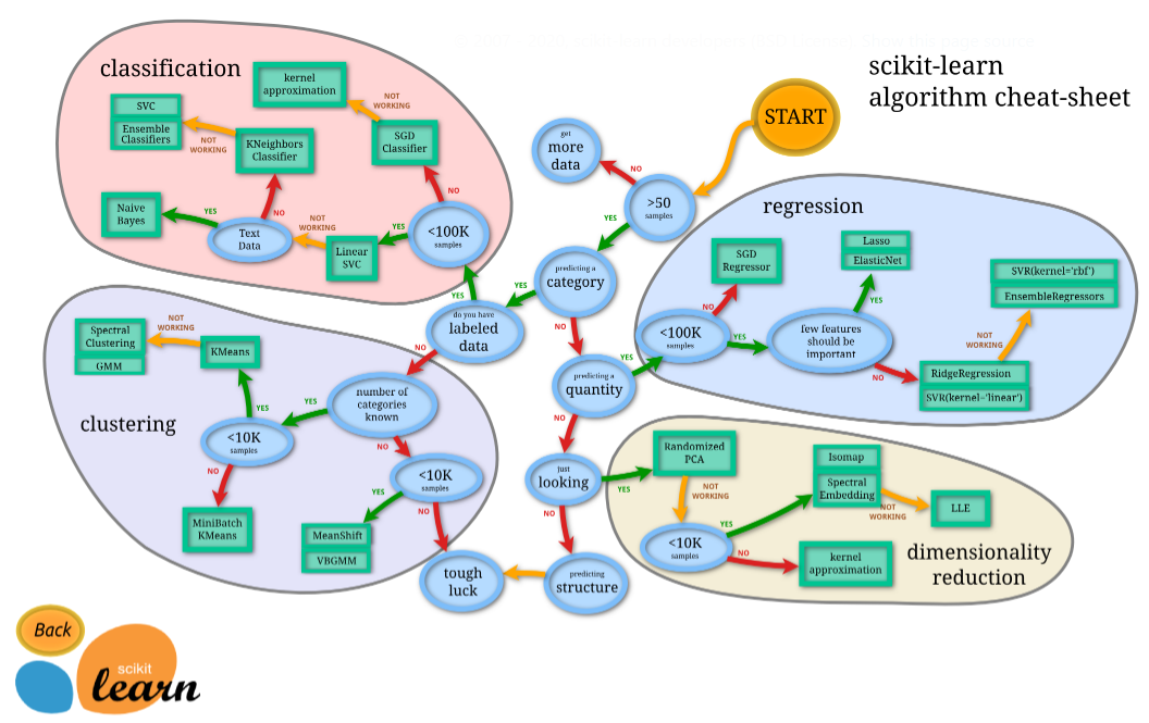
⇧ scikit-learn の公式のサイトで、紹介してくれてますと。
ただ、
ただし、このマップは2013年に公開されたもので、さすがに登場しているアルゴリズムがちょっと古い感があります。多くのアルゴリズムがその後進化しているので、代わりに重宝するのがマイクロソフトの機械学習サービスMicrosoft Azure Machine Learningのホームページに公開されているAlgorism Cheat Sheetです。
⇧ 上記サイト様によりますと、新しい情報を確認するなら、Microsoft AzureのMachine Learningの情報を参照したほうが良いみたいね。
それは、さておき、

⇧ 上記サイト様によると、機械学習のアルゴリズムは大きく分けて、上図のように分類できますと。(「dimensionality reduction」は「次元削減」みたいなので、機械学習アルゴリズムには含めない感じなんですかね。)
今回、出てくる「混同行列(Confusion Matrix)」ってのは、「教師あり学習」の「CLASSFICATION(分類)」の「TWO-CLASS CLASSFICATION(分類(2値))」 の機械学習モデルの性能評価指標で必要な概念なのかと。
と思ったら、「MURTI-CLASS CLASSFICATION(分類(マルチ))」でも「混同行列(Confusion Matrix)」使えるって情報を発信してる方がおられました。
混同行列(Confusion Matrix)って?
英語版のWikipediaさんによると、
In the field of machine learning and specifically the problem of statistical classification, a confusion matrix, also known as an error matrix, is a specific table layout that allows visualization of the performance of an algorithm, typically a supervised learning one (in unsupervised learning it is usually called a matching matrix). Each row of the matrix represents the instances in a predicted class, while each column represents the instances in an actual class (or vice versa). The name stems from the fact that it makes it easy to see whether the system is confusing two classes (i.e. commonly mislabeling one as another).
It is a special kind of contingency table, with two dimensions ("actual" and "predicted"), and identical sets of "classes" in both dimensions (each combination of dimension and class is a variable in the contingency table).
⇧ 「教師あり学習」における機械学習モデルのアルゴリズムのパフォーマンスを計るための表らしいですと。
「教師なし学習」の場合は、「Matching Matrix」って呼ばれるらしい。(「Matching Matrix」についての説明が一切ないので「混同行列(Confusion Matrix)」と同じ内容と考えて良いのかは不明)
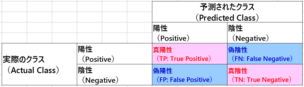
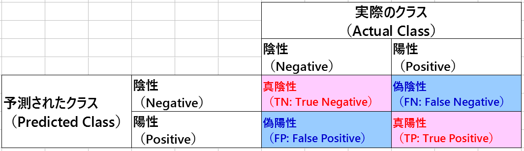
で、「混同行列(Confusion Matrix)」は、「Actual Class(実際のクラス)」と「Predicted Class(予測されたクラス)」 があり、「教師あり学習」で使用される性能評価指標に利用されるってことらしいんですが、「二項分類」ってものケースについての説明が英語版Wikipediaの「Confusion Matrix」の説明になるかと。
「二項分類」はと言うと、
二項分類(にこうぶんるい、英: Binary classification)は、オブジェクトの集合を個々のオブジェクトがある特定の属性を持つかどうかで2種類にグループ分けする分類作業である。二値分類(にちぶんるい)、2クラス分類とも呼ばれ、多クラス分類において分類先のクラス数が2の場合と考えることができる。
⇧ というような説明となっております。
「混同行列(Confusion Matrix)」に話を戻すと、なんか、
⇧ 縦軸と横軸は自由っぽいですね。
と言うか、「他クラス分類」でも「混同行列(Confusion Matrix)」は使えるみたいですね。
話が脱線しましたが、英語版のWikipediaだと、縦軸に「Actual Class(実際のクラス)」で横軸に「Predicted Class(予測されたクラス)」 ってなってましたけど、このあたりはそんな気にしなくても良いのかね?
■横軸:Actual Class(実際のクラス)、縦軸:Predicted Class(予測されたクラス)
【内側:Positive(陽性)、外側:Negative(陰性)の構成の場合】
【内側:Negative(陰性)、外側:Positive(陽性)の構成の場合】

■横軸:Predicted Class(予測されたクラス)、縦軸:Actual Class(実際のクラス)
【内側:Positive(陽性)、外側:Negative(陰性)の構成の場合】

【内側:Negative(陰性)、外側:Positive(陽性)の構成の場合】
で、「混同行列(Confusion Matrix)」に関連する用語が出てくるんだけれど、用語の意味などや実際に「混同行列(Confusion Matrix)」がどのように使われるかは、
⇧ 上記サイト様が詳しいです。
ROC曲線(Receiver Operating Characteristic Curve)って?
Wikipediaさんによりますと、
A receiver operating characteristic curve, or ROC curve, is a graphical plot that illustrates the diagnostic ability of a binary classifier system as its discrimination threshold is varied. The method was originally developed for operators of military radar receivers, which is why it is so named.
https://en.wikipedia.org/wiki/Receiver_operating_characteristic
The ROC curve is created by plotting the true positive rate (TPR) against the false positive rate (FPR) at various threshold settings. The true-positive rate is also known as sensitivity, recall or probability of detection in machine learning.
https://en.wikipedia.org/wiki/Receiver_operating_characteristic
⇧ ってな感じで、「閾値」を変化させての「二項分類」による判定の結果をマッピングしたグラフらしい。
「偽陽性率(FPR:False Positive Rate)」に対して「真陽性率(TPR:True Positive Rate)」をプロットしますと。
「混同行列(Confusion Matrix)」に着目すると、「偽陽性率(FPR:False Positive Rate)」は、
「真陽性率(TPR:True Positive Rate)」は、
っていう式で算出する感じになるらしい。
「ROC曲線」がどんな風な形になるかは、

⇧ 上図がイメージしやすいかと。
- X軸:「偽陽性率(FPR:False Positive Rate)」
- Y軸:「真陽性率(TPR:True Positive Rate)」
に描かれる曲線で、「真陽性率(TPR:True Positive Rate)」の値が1に近づくほど良い評価になるということらしい。
上図でいうと、水色の曲線が一番良いROC曲線になるということになる模様。
⇧ って感じで、「閾値」ごとに「混同行列」の内容は変わる感じですかね。
「閾値」は「データ」を確認して自分で決めてあげる必要があるとは思うけど、上記サイト様の場合は、「データ」の中で重複してないもの全ての数だけ「閾値」を設定してるっぽいですかね。
PR曲線(Precision Recall Curve)って?
ROC曲線(Receiver Operating Characteristic Curve) が、
- X軸:「偽陽性率(FPR:False Positive Rate)」
- Y軸:「真陽性率(TPR:True Positive Rate)」
を軸とした曲線だったのに対して、「PR曲線(Preceiver Operating Curve)」は、
- X軸:「再現率(Recall)」
- Y軸:「適合率(Precision)」
を軸とする曲線になるようです。
ちなみに、
「真陽性率(TPR:True Positive Rate)」と「再現率(Recall)」は同じものを違う言葉で言ってるだけっぽい、紛らわしいけど...
英語版のWikipediaでも
sensitivity, recall, hit rate, or true positive rate (TPR)

⇧ 呼び名が「sensitivity」「recall」「hit rate」「true positive rate (TPR)」って異なってるのに同じものを指してるというね、Oh, my gosh...
なんか確実に認識齟齬を来すような気がしてならんのだけど...
「PR曲線(Preceiver Operating Curve)」は、
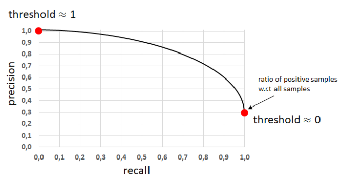
⇧ 右肩下がりの曲線になるみたいですね。
ROC曲線(Receiver Operating Characteristic Curve)とPR曲線(Preceiver Operating Curve)の使い分けって?
使い分けってどうすれば?
Generally, the use of ROC curves and precision-recall curves are as follows:
- ROC curves should be used when there are roughly equal numbers of observations for each class.
- Precision-Recall curves should be used when there is a moderate to large class imbalance.
PR曲線には、偏りが大きいデータに対する予測も適切に評価できるという特徴があります。偏りが大きいデータの例として、工場における機械の故障検知などが挙げられるでしょう。故障をPositive、正常な状態をNegativeとして、データを取って機械が故障していないかを観測しているとします。まともな機械を使っていればほとんどのデータがNegativeとなるでしょうが、このようなデータを用いた予測を評価するのは容易ではありません。このような場合に、PR曲線におけるAUCが用いられるのです。
インバランスデータ(著しくPositiveに対してNegativeが多いデータ)に使われます。異常検知問題のデータセットはほとんどがこういう場合です。異常がPositive、正常がNegativeになります。
⇧ 上記サイト様によりますと、ザックリ分けると、
- ROC曲線(Receiver Operating Characteristic Curve)
偏りの小さいデータを扱う場合 - PR曲線(Preceiver Operating Curve)
偏りの大きいデータを扱う場合
って感じで使い分けるべきらしいですね。
ソフトウェア開発で言うところの「異常系」のテストみたいに、異常が起こった場合を正常と考えるようなもんですかね?
まぁ、PR曲線が「再現率(Recall)」と「適合率(Precision)」を軸としてた理由が見えましたかね。
と言うのも、「混同行列(Confusion Matrix)」に着目すると、「再現率(Recall)」は、
「適合率(Precision)」は、
ってな感じで、Positiveの割合を意識してますかね。
AUC(Area Ander Curve)って?
Wikipediaさんによりますと、
Area under the curve
When using normalized units, the area under the curve (often referred to as simply the AUC) is equal to the probability that a classifier will rank a randomly chosen positive instance higher than a randomly chosen negative one (assuming 'positive' ranks higher than 'negative').
https://en.wikipedia.org/wiki/Receiver_operating_characteristic
This can be seen as follows: the area under the curve is given by (the integral boundaries are reversed as large threshold has a lower value on the x-axis)


where is the score for a positive instance and is the score for a negative instance, and and are probability densities as defined in previous section.


https://en.wikipedia.org/wiki/Receiver_operating_characteristic
It can further be shown that the AUC is closely related to the Mann–Whitney U, which tests whether positives are ranked higher than negatives. It is also equivalent to the Wilcoxon test of ranks. For a predictor , an unbiased estimator of its AUC can be expressed by the following Wilcoxon-Mann-Whitney statistic:

![{\displaystyle AUC(f)={\frac {\sum _{t_{0}\in {\mathcal {D}}^{0}}\sum _{t_{1}\in {\mathcal {D}}^{1}}{\textbf {1}}[f(t_{0})<f(t_{1})]}{|{\mathcal {D}}^{0}|\cdot |{\mathcal {D}}^{1}|}},}](https://wikimedia.org/api/rest_v1/media/math/render/svg/a65ad3f875a1cefbda573962cee7abbb05aa3bcf)
where, denotes an indicator function which returns 1 iff otherwise return 0; is the set of negative examples, and is the set of positive examples.
![{\textstyle {\textbf {1}}[f(t_{0})<f(t_{1})]}](https://wikimedia.org/api/rest_v1/media/math/render/svg/03407a2c3018d99fb12703e2327bfbf84b9ce426)


The AUC is related to the *Gini coefficient* () by the formula , where:


https://en.wikipedia.org/wiki/Receiver_operating_characteristic
⇧ って感じで、数式とかはサッパリ意味の分からん状態なんですが、「ROC曲線」で囲まれた下の部分の面積のことを「AUC(Area Under Curve)」と言うそうな。

ROC は推測曲線と呼ばれ縦軸にTPR(True Positive Rate)、横軸にFPR(False Positive Rate) の割合をプロットしたものです。 AUC(Area Under the Curve) はその曲線の下部分の面のことで、AUC の面積が大きいほど一般的に機械学習の性能が良い事を意味します。
⇧ 上記サイト様のイメージ図が分かりやすいです。
なので、「AUC(Area Under Curve)」ってのは、
- ROC曲線(Receiver Operating Characteristic Curve)
- PR曲線(Preceiver Operating Curve)
などとセットで考える感じになるってことなんですかね。
毎回モヤモヤ感が半端ないけども...
今回はこのへんで。